
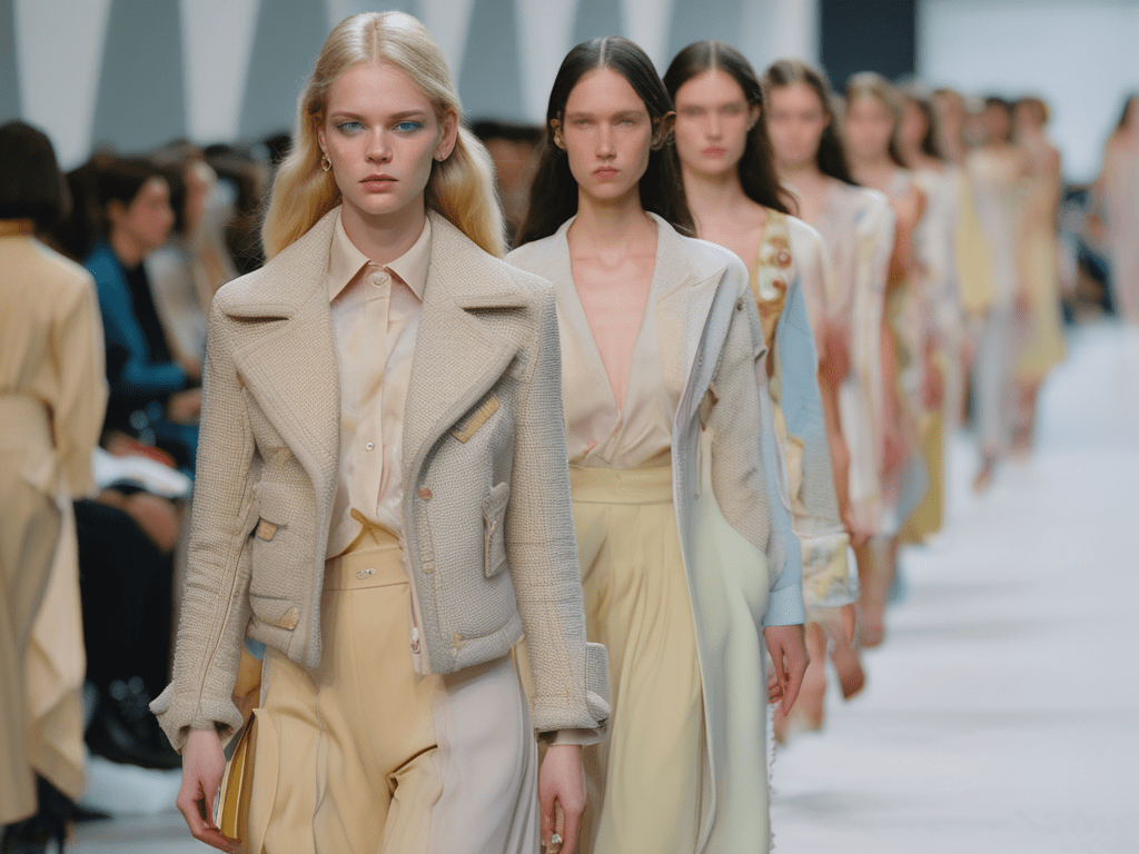
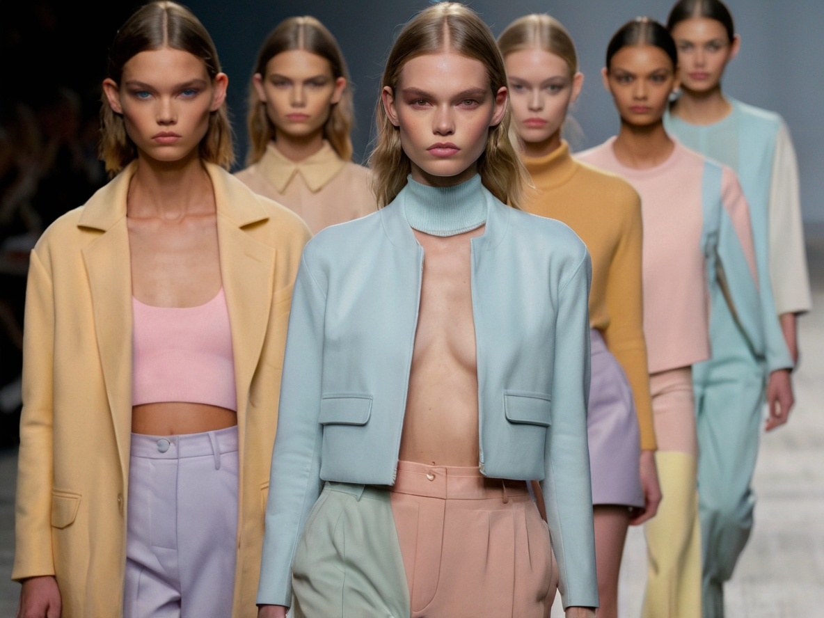
There are few who deny the long-lasting effects of COVID on our daily lives, but no one was ready for it enter the fashion and design industries post-epidemic as a trending color palette. The muted tones popping up on runways and featured decor colors are muted tones of pastels, most notably the 2024 standout of butter lemon.
When we speak of muted colors, they are created from the traditional primary and secondary colors being desaturated. They are in direct opposition to bold, vivid colors. Now, that we have had our brief art lesson, let’s move on to medical knowledge.
One of the most talked about and fear COVID symptoms drove the sale of home oxygen meters through the roof. As oxygen is depleted from the blood, the levels on the meter would decrease. As Lois Fitz, noted biomedical researcher and fashion icon, noted, “”A key feature for COVID was oxygen deprived hemoglobin, or desaturation. It is no wonder we have adjusted our lives to be desaturated as well.”
While this link between our collective recovery and the fashion industry could be merely coincidental, Dr. Fitz is not doubting the correlation at all. “Fashion has always reflected our view of the world and what is important to us,” she continued.
There us still research to be done, but Dr. Fitz and her team at the Delwindom Insitute for Medical Design are on the hunt for answers.


Leave a comment